How to Make Advanced Data Visualizations in Illustrator
SIMPLIFIED SCIENCE PRO
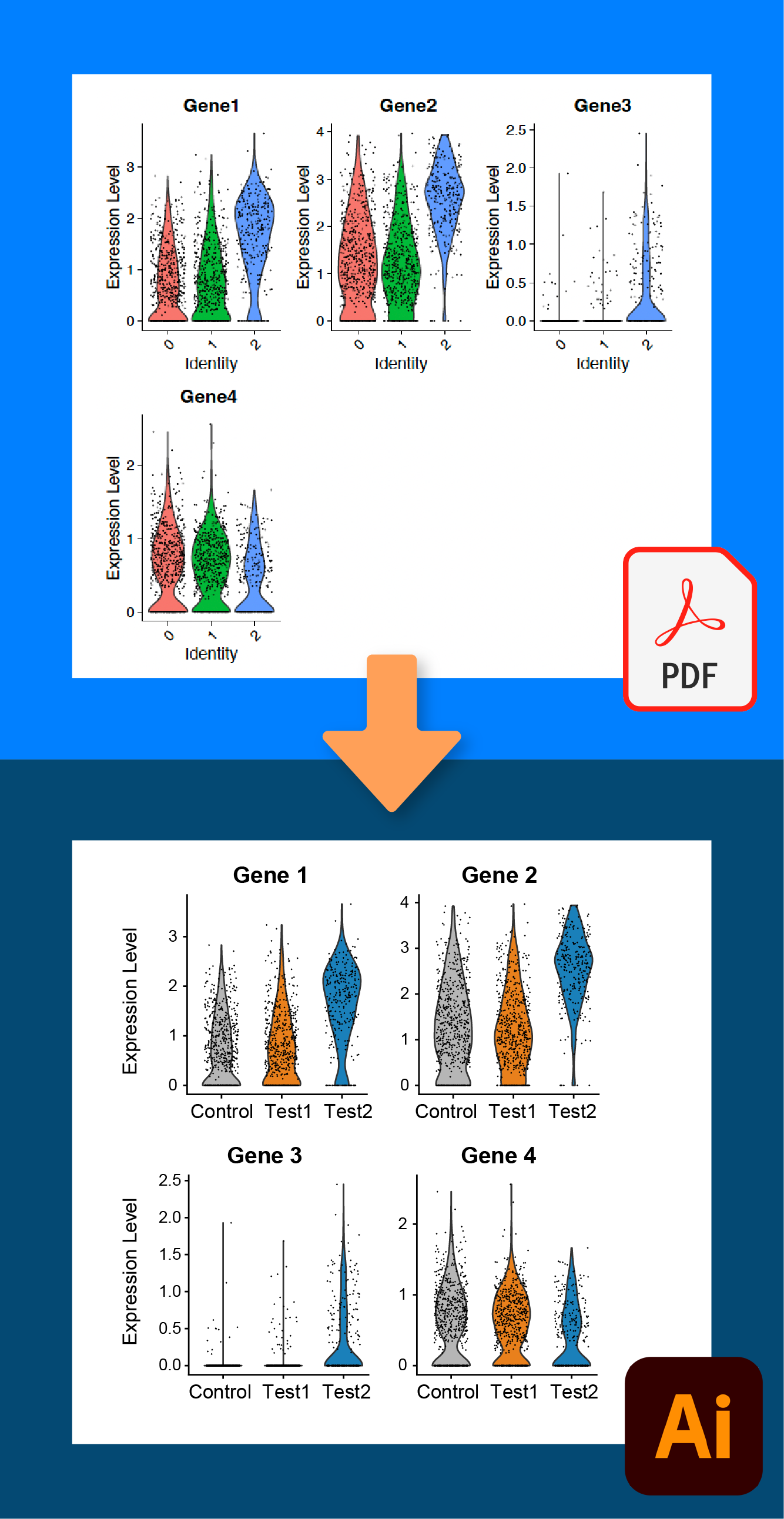
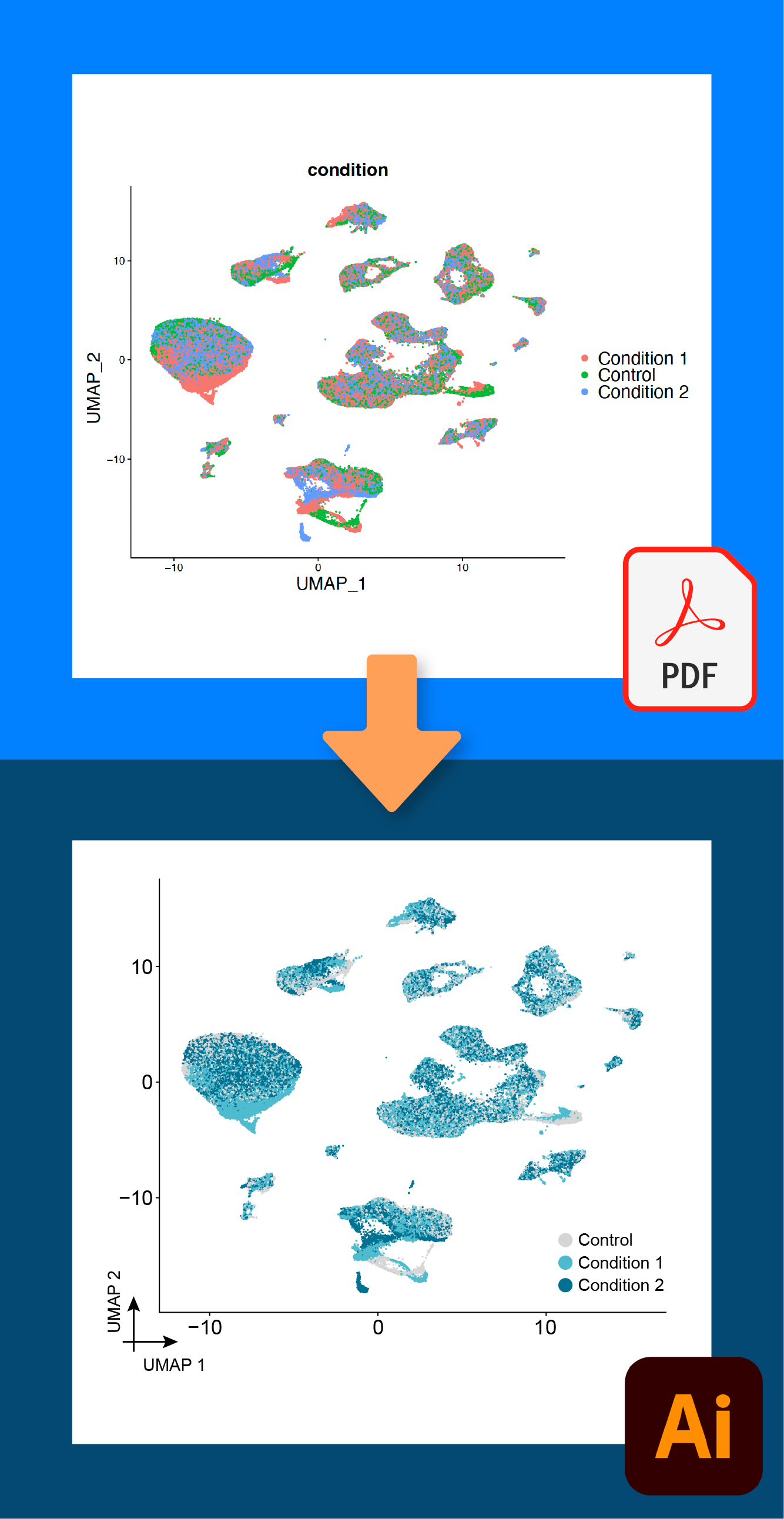
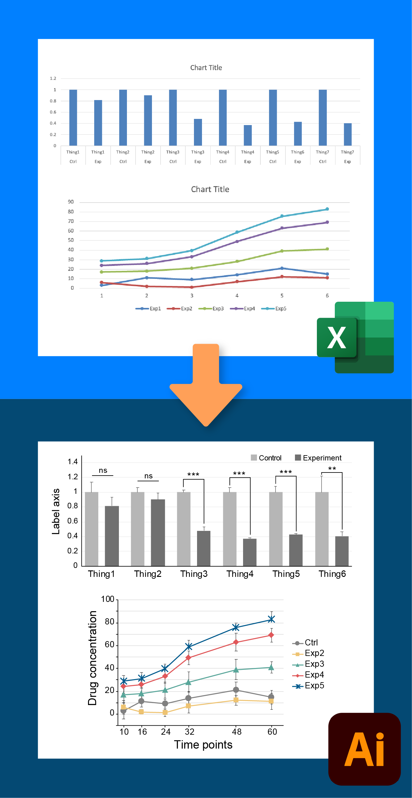
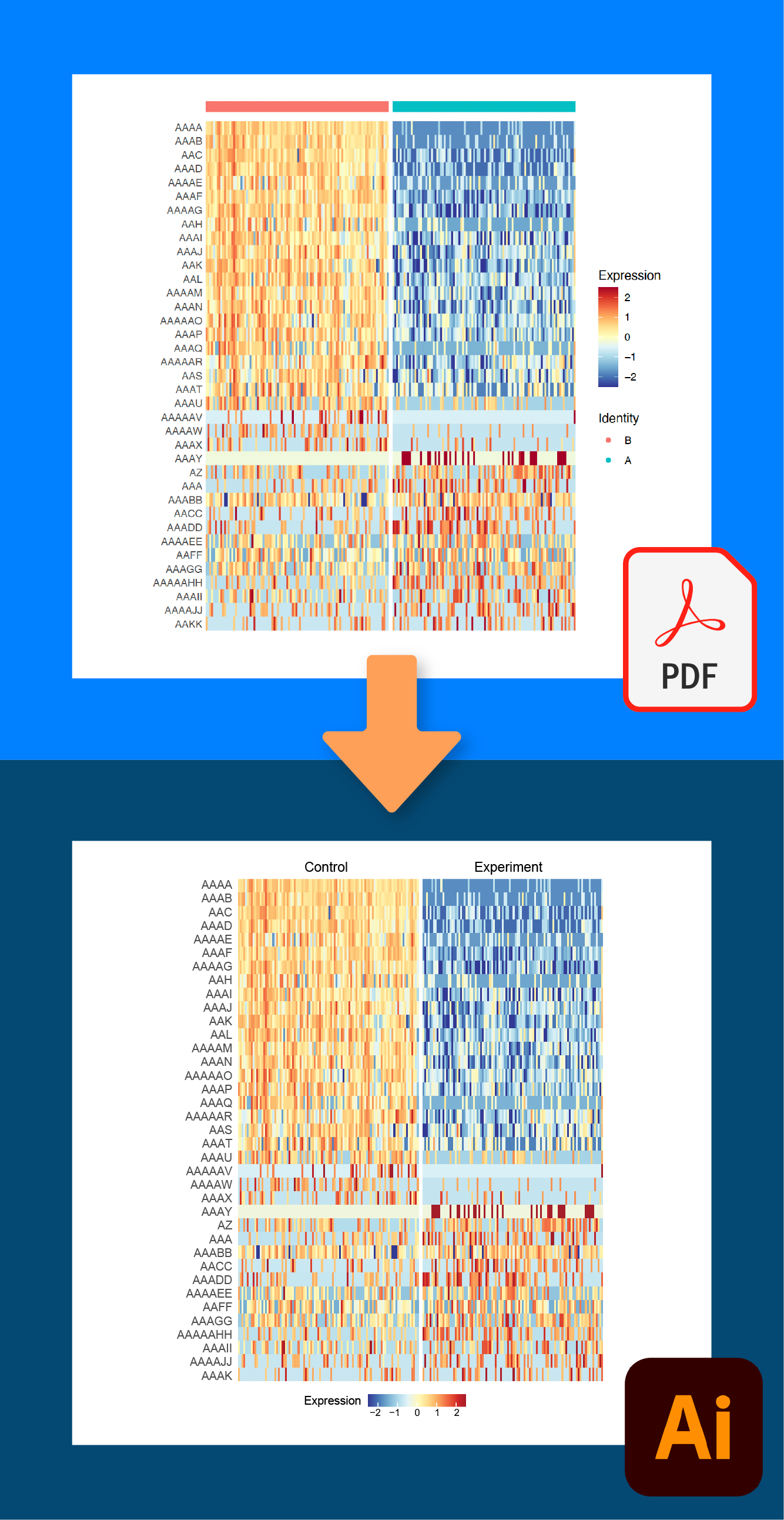
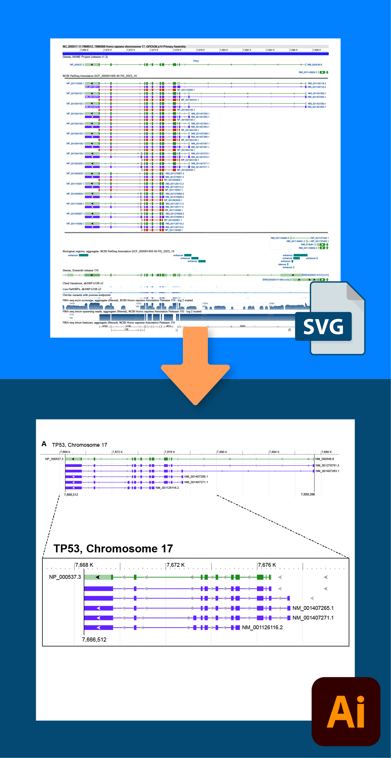
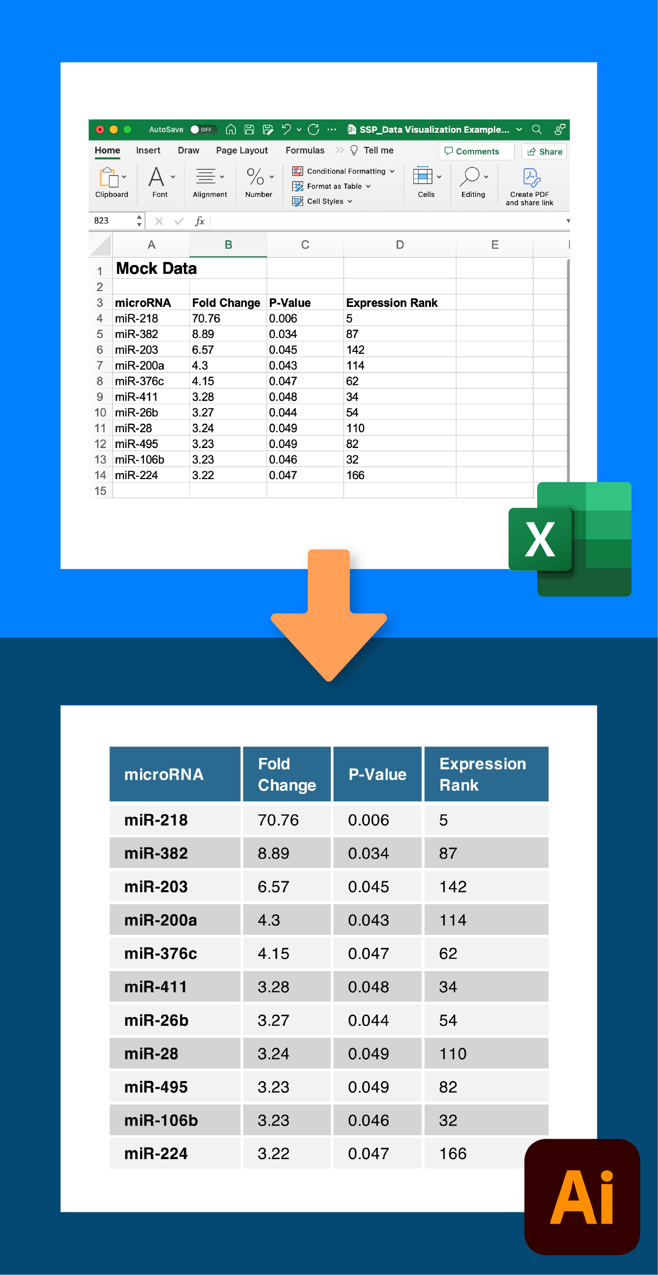
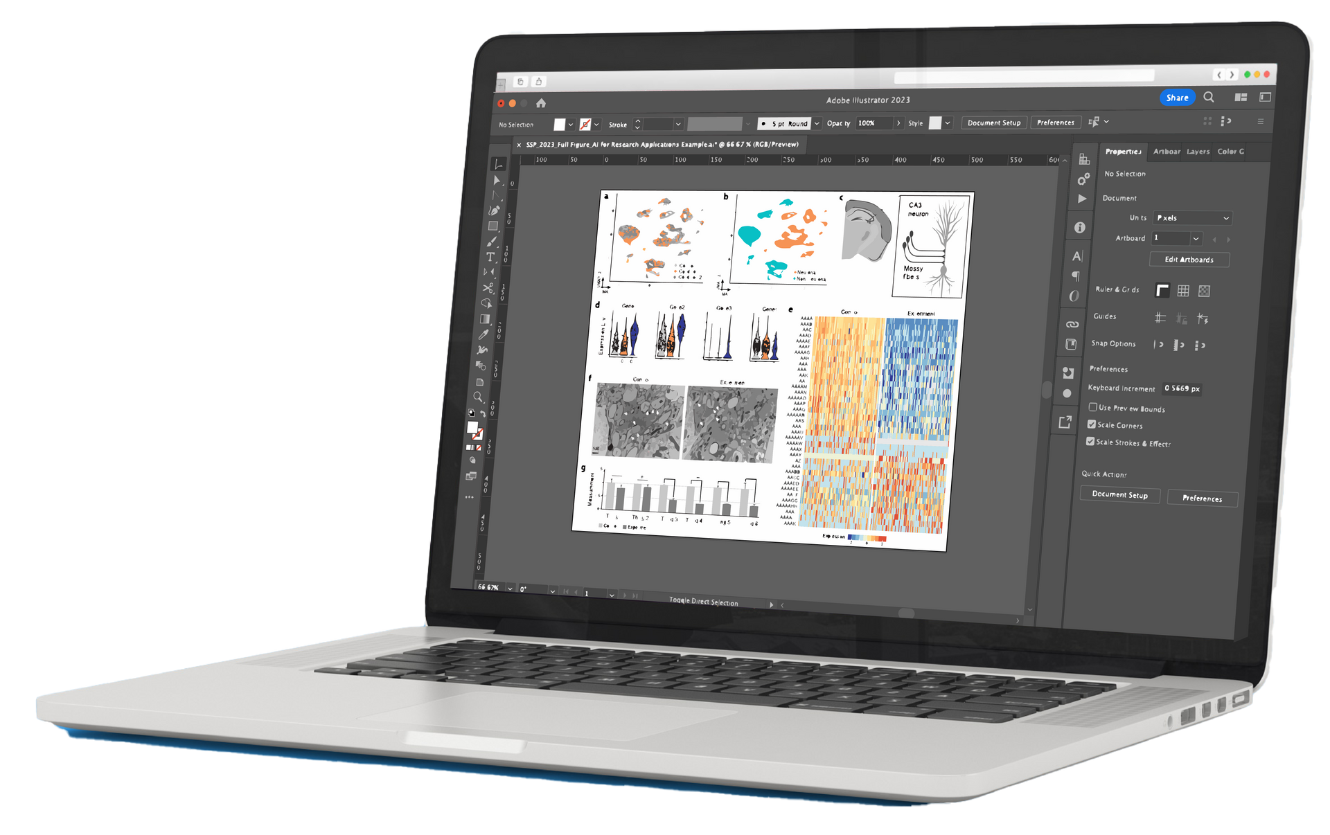
Tutorials to create professional data visualizations and graphs from PDF graphing output, SVG files, and Excel. Includes UMAP clustering, violin plots, heat maps, bar charts, and more!
Learn in-demand data visualization tools and techniques with these efficient tutorials. In this online course, you will:
- Learn how to use Adobe Illustrator to transform PDF and SVG data output from graphing software such as Matlab, R, Genome Data Viewer, and Excel into publication-ready figures.
- Get expert tips on how to ethically optimize your data visualization colors, text, plot sizes, axes, and line widths.
- Learn how to quickly format your data visualizations for science paper figure submissions.
- Download Excel graphing templates for bar charts, line graphs, box and whisker plots, pie charts, and tables.
Advanced / 2.5 hours of tutorial videos
If you are new to working in Adobe Illustrator, watch Chapters 1-4 of the Introduction to Adobe Illustrator for Scientists course first.

Course Instructor
Karen Thiebes is a professional scientific illustrator and has a Ph.D. in Neuroscience from Oregon Health & Science University. She has led scientific design courses for over 8 years and enjoys teaching participants how to quickly transform data into effective designs using Adobe Illustrator, PowerPoint, Affinity Designer, and Excel.
Advanced Online Courses
Sign up to receive access to this course and all of the Simplified Science courses for only $59. New courses are added every year to stay up-to-date with the latest scientific design techniques. The Pro courses also include popular templates such as the Biological Diagrams, Laboratory Tools, and Excel graphing templates with over 400 illustrations that you can use in your own scientific designs. Learn more here!
