Data Storytelling Techniques: How to Tell a Great Data Story in 4 Steps
Learn More About Simplified Science PublishingData storytelling is a powerful tool that makes your data visualizations memorable and easy to understand.
Data storytelling has become an increasingly popular method for sharing complex information. Whether you are a journalist, business professional, or a scientist, this article will review four easy steps that you can follow to create an effective data story.
What is Data Storytelling and Why Should I Care?
Data storytelling is the method of translating data analyses into an understandable and engaging story that makes it memorable for the audience. Common types of data storytelling include infographics, data visualizations, and scientific illustrations.
Creating good data stories is important because complex data and analytics can be difficult for people to understand. By using data storytelling techniques, you can help a wider audience understand the main points of complicated information and it can be a powerful tool to influence people's decisions.
Data Storytelling Example
The image below shows a data storytelling example that uses bar charts and color design to highlight the main characters of a story about graduate rates for bachelor degrees. The graph on the left shows general information about graduate rates for bachelor degrees from the National Center for Education Statistics. When looking at the original data graphic, it takes a while to realize that the most meaningful information in the graph is that the private for-profit institutions have a much lower graduation rate.

The optimized graph on the right shows the exact same data, but instead uses data storytelling techniques to create a clear narrative that makes the most important information stand out. The main character of the data story is the high drop-out rate at private for-profit institutions compared to the other types of public and private institutions, so this has the boldest color that stands out from the rest of the data visualization. The improved graphic also simplifies the storyline by making the dataset only represent the change between graduated versus drop-out rates of all students, instead of using separate bars for different genders that had relatively similar graduation rates. By creating a clear story and using good color design, the dataset was transformed from a confusing bar graph into a clear data visualization where the main point is memorable and easy to understand.
Data Storytelling Techniques: The 4 Steps
Good stories contain four main elements: characters, setting, conflict, and resolution. In order to make a good data story, you can use these elements to frame the complex information into compelling visualizations. It may seem odd to think about your data points as characters in a story, but the steps below outline a proven technique to make your data story stand out from the crowd.
Step 1: List the characters
Create a short list of the 2-4 most important characters in your data story. These could be proteins, medications, or even methods. Think of the main data points or information as as heroes, villains, and supporting characters for the story.
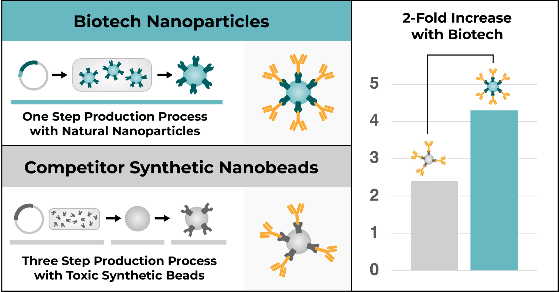
For example, let's say that a biotechnology company creates a new product that improves an antibody purification process. The three main characters of this story would be the new biotech product, the competitor products, and the antibodies that become purified in the process. The hero is the biotech product, the villain is the competitor products, and the antibodies are the supporting characters.

Step 2: Define the setting
The setting of a data story could be the methods, the scientific tools used, or the scientific background information. Use the setting as the scaffolding that allows your audience to make sense of the story but doesn’t play a major role in the outcome.
With the biotechnology example, the setting is the purification process that creates the hero and the villain characters. The biotech company product simplifies the process so that there is only one step to create the new natural nanoparticle product instead of three steps, and makes the process less toxic.

Step 3: Describe the Conflict
Conflicts in data stories are often focused on describing a decrease or increase after a scientific experiment. If there isn’t a clear conflict such as data showing a robust change, you can skip this element and instead just go straight to describing the resolution or results of the data analysis.
The conflict in the biotechnology product example is the performance of the product compared to competitors. You are asking your audience: which product will be more successful at purifying antibodies?

Step 4: Propose a Resolution
In data storytelling, the resolution is a synonym for the results. Everything in the story is leading to the main result that you want your audience to understand at the end.
The resolution for our example data story is the better performance of the biotech company's product. Taking these storytelling elements into account, we can now design a full infographic with illustrations and a graph that highlights this biotech product hero’s data story (see below).

Additional Storytelling Design Tips
Color Design
- Only apply bold/bright colors to the elements that you want to attract your audience's attention (e.g. the main characters of the story).
- Choose colors that are accessible to people with all types of color blindness.
- Read this article to learn more about choosing accessible colors for data visualizations
Choose the Right Kind of Data Visualization/Graph
- To determine which kind of graph you should use for your data story, I recommend defining the main purpose of the data first and then choosing the graph that best matches the purpose. Visualizations can be grouped into five main purpose categories: explain a process, compare or contrast, show a change, establish a relationship, or other.
- Read this article about data visualization tools to help you determine the purpose of your data with example charts and graphics
Use Illustrations to Emphasize Your Story
Reference:
- Source for National Center for Education Statistics data: https://nces.ed.gov/fastfacts/display.asp?id=40
Create professional science figures with illustration services or use the online courses and templates to quickly learn how to make your own designs.
Interested in free design templates and training?
Explore scientific illustration templates and courses by creating a Simplified Science Publishing Log In. Whether you are new to data visualization design or have some experience, these resources will improve your ability to use both basic and advanced design tools.
Interested in reading more articles on scientific design? Learn more below:
Content is protected by Copyright license. Website visitors are welcome to share images and articles, however they must include the Simplified Science Publishing URL source link when shared. Thank you!


