

Free Research Poster Templates and Tutorials
Learn More About Simplified Science PublishingCreating engaging research posters is an important skill for every scientist. This guide provides design tips and detailed tutorials for making posters using free templates.
Scientific Poster Templates
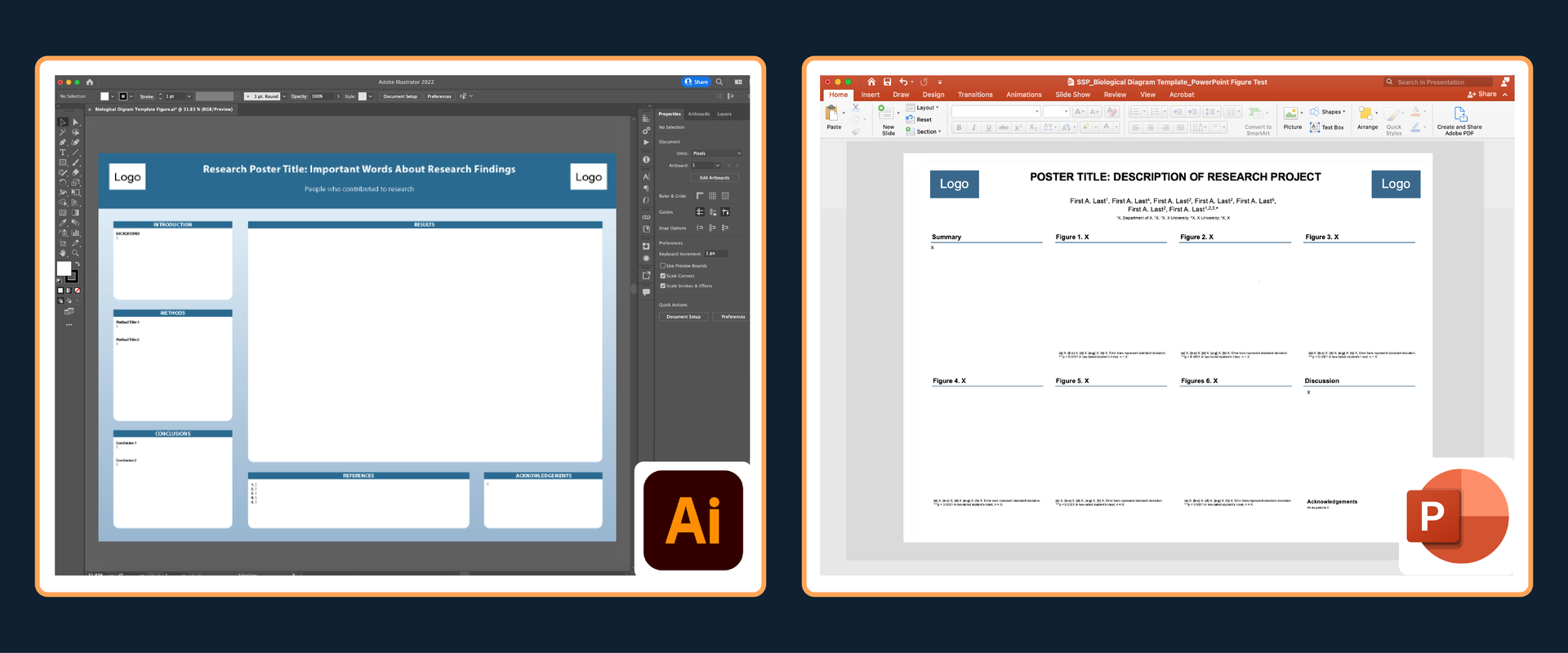
Whether you are creating a research poster for the first time or have years of experience, this article reviews helpful tips on how to create effective designs. There are also links to free poster templates and videos that show you how to create effective scientific posters in PowerPoint and Adobe Illustrator.

How to Make Good Poster Content
My top recommendation for creating an engaging poster for a scientific conference is to describe your results with simple main points that allow your audience to easily follow your research with minimal effort. The sections below describe how to use main point brainstorming to create poster titles and subtitles that improve audience understanding.
Step 1. Create Short Main Points
People don't spend much time reading the poster, so the shorter you can make the main points, the better. My favorite way to determine the main points of your research poster is to brainstorm a full list of all of your research results and then create a shorter sentences that clearly summarize the information that you want your audience to know.
The first drafts of your main points can be long sentences with jargon, but the goal is to then take these full descriptions and transform them into simple phrases that allow poster viewers to visualize the results.
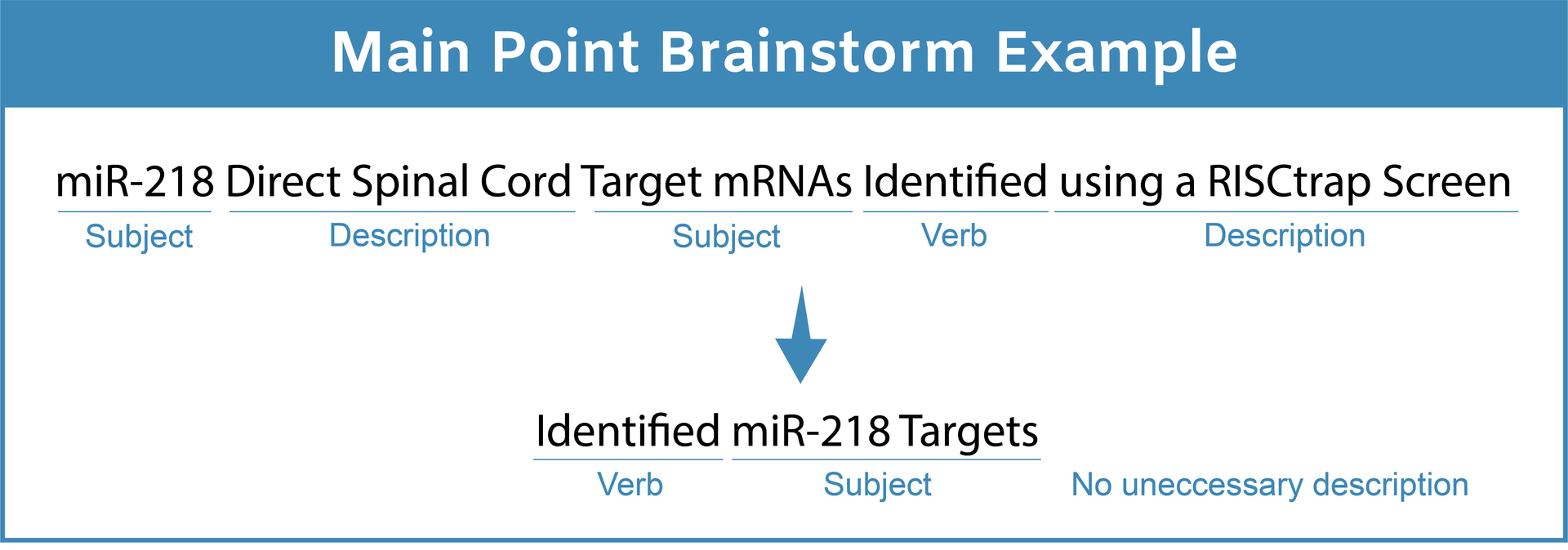
My tip for creating clear main points is to reduce the number of subjects, remove descriptions, and do not use more than one or two verbs. In scientific research results, there is almost always one main point action (e.g. something increases, decreases, changes, or stays the same) involving one to three components. Below are more examples of how to do this main point simplification.
Main Point Examples:
- Brainstorm: Identification of miRNAs Upregulated by Isl1-Lhx3 During Motor Neuron Differentiation
- Better: miRNAs Upregulated During Motor Neuron Differentiation
- Best: miRNAs Upregulated in Developing Motor Neurons
- Brainstorm: miR-218 Direct Spinal Cord Target mRNAs Identified using a RISCtrap Screen
- Better: Identification of miR-218 Target mRNAs
- Best: Identified miR-218 Targets
- Brainstorm: Inhibition of miR-218 Activity Suppresses Endogenous Motor Neuron Generation
- Better: miR-218 Inhibition Suppresses Motor Neuron Generation
- Best: miR-218 is Important for Motor Neuron Development
Step 2: Create an Effective Research Poster Title
The poster title is one of the first things your audience reads and plays an important role in helping people understand your results. In order to create an effective title, I recommend that you take your optimized list of main points and try to summarize them with one big picture phrase. This is also a great way to help you brainstorm the title for research publications, but keep in mind that the poster title should be more reader-friendly than a manuscript title and use less details.
Poster Title Example:
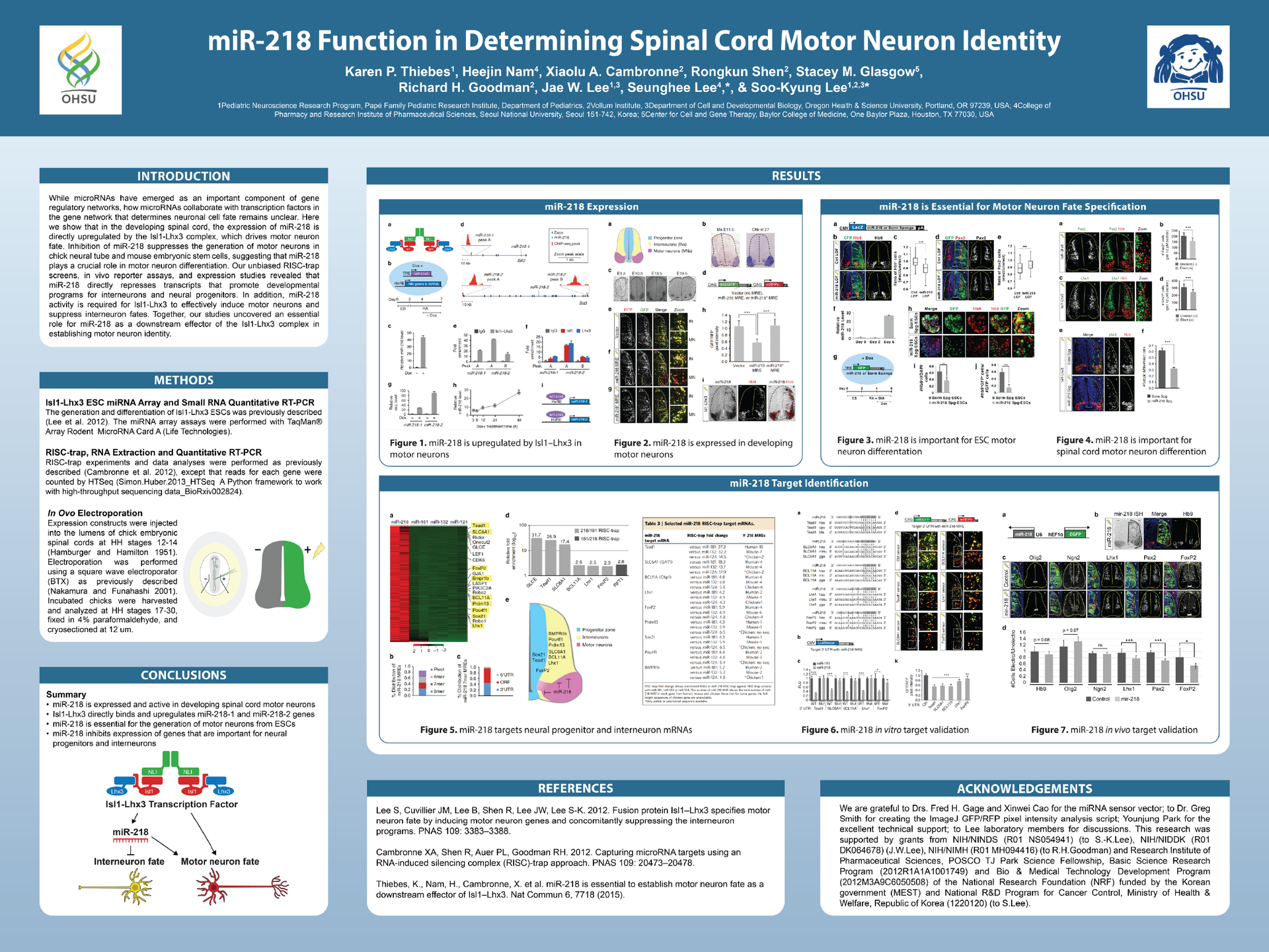
- Brainstorm: miR-218 is Essential to Establish Motor Neuron Fate as a Downstream Effector of Isl1–Lhx3
- Better: miR-218 is Essential in Determining Spinal Cord Motor Neuron Identity
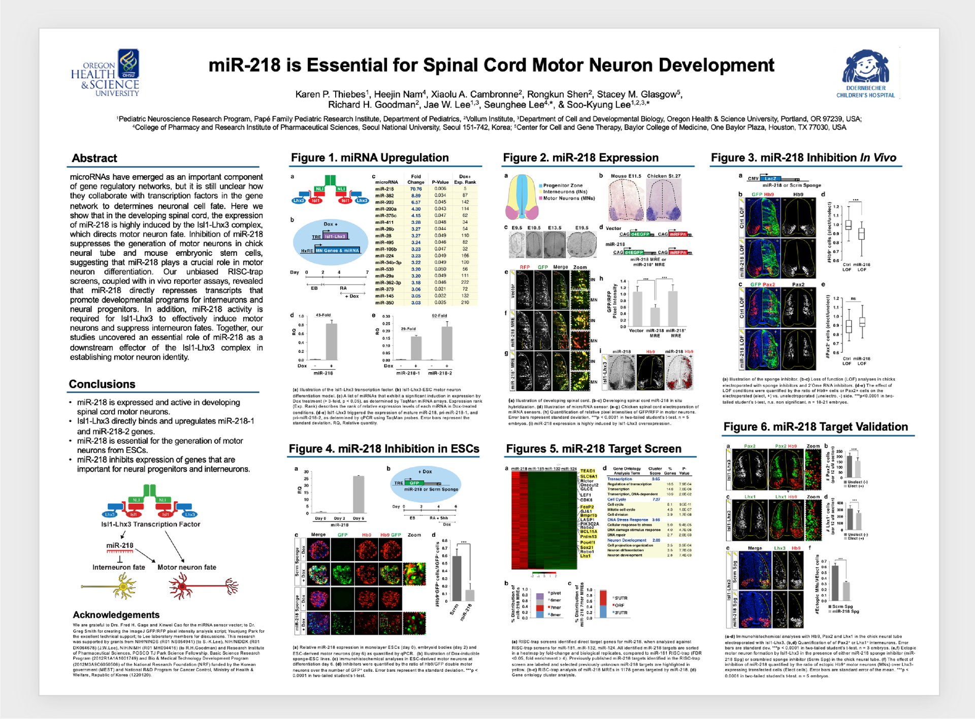
- Best: miR-218 is Essential for Spinal Cord Motor Neuron Development
The brainstorm example above was used as the title for my first-author Nature Communications paper, but unless you are in my lab or in the exact same field of research, the term "Isl1-Lhx3" may not have much meaning for you and "downstream effector" is not a common phrase. Poster titles should use more common words that are easily understood outside of my specific field of developmental biology.
Reference: All content and data examples are from my open source first-author publication in Nature Communications.
Step 3. Create Poster Sections that Support the Main Points
After the title and main points are created, you can use these short phrases as subtitles that categorize your poster into sections that help your audience digest the information. The examples below show how you can use the main points to create guideposts in the results and a clear conclusions section that simplify the scientific story.
Research Poster Design Tips
Good visual design is also an essential part of creating an engaging research poster. People pay closer attention to details when they are easy to understand and interesting to look at. This requires that you use design best practices for color design, images, and composition to improve audience understanding. Learn how to improve your scientific poster designs with the tips below.
Poster Color Design
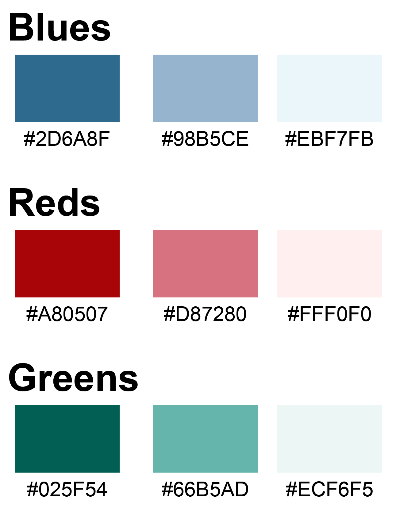
Colors can make a poster standout from the crowd and enhance audience understanding. My recommendation is to use poster colors that follow the three rules below:
- Choose a light background color does not distract from the main points, such as muted blues, reds, or greens (see example image).
- Choose colors that don't have conflicts for people with color blindness.
- Limit the total number of colors used and use bright colors draw attention to the most important points of the poster.
Learn more about scientific color design in this review article:
Poster Illustrations and Images
The most engaging posters also contain custom illustrations or images that show the methods and results of your research. Most people will read the title and then look for pictures that enhance their understanding of your scientific story.
Consider creating custom illustrations to explain your methods and conclusions section using Adobe Illustrator, Affinity Designer, or Inkscape. Check out the resources below for more information on how to use scientific illustration templates and how to create your own designs.
Scientific Illustration and Image Resources
- Free Online Courses and Templates
- Animal Model and Research Illustrations
- Alternatives to BioRender
- How to Use Scientific Images

Poster Composition and Data Visualization
Good poster design also requires that you use an engaging layout and data visualizations. The goal is to make the poster easy-to-understand by using good composition techniques that reduce clutter and use graphs that make the main point clear. Below are some helpful resources that teach you how to create designs for effective scientific storytelling and figures within your poster.

Create professional science figures with illustration services or use the online courses and templates to quickly learn how to make your own designs.
Interested in free design templates and training?
Explore scientific illustration templates and courses by creating a Simplified Science Publishing Log In. Whether you are new to data visualization design or have some experience, these resources will improve your ability to use both basic and advanced design tools.
Interested in reading more articles on scientific design? Learn more below:


Content is protected by Copyright license. Website visitors are welcome to share images and articles, however they must include the Simplified Science Publishing URL source link when shared. Thank you!